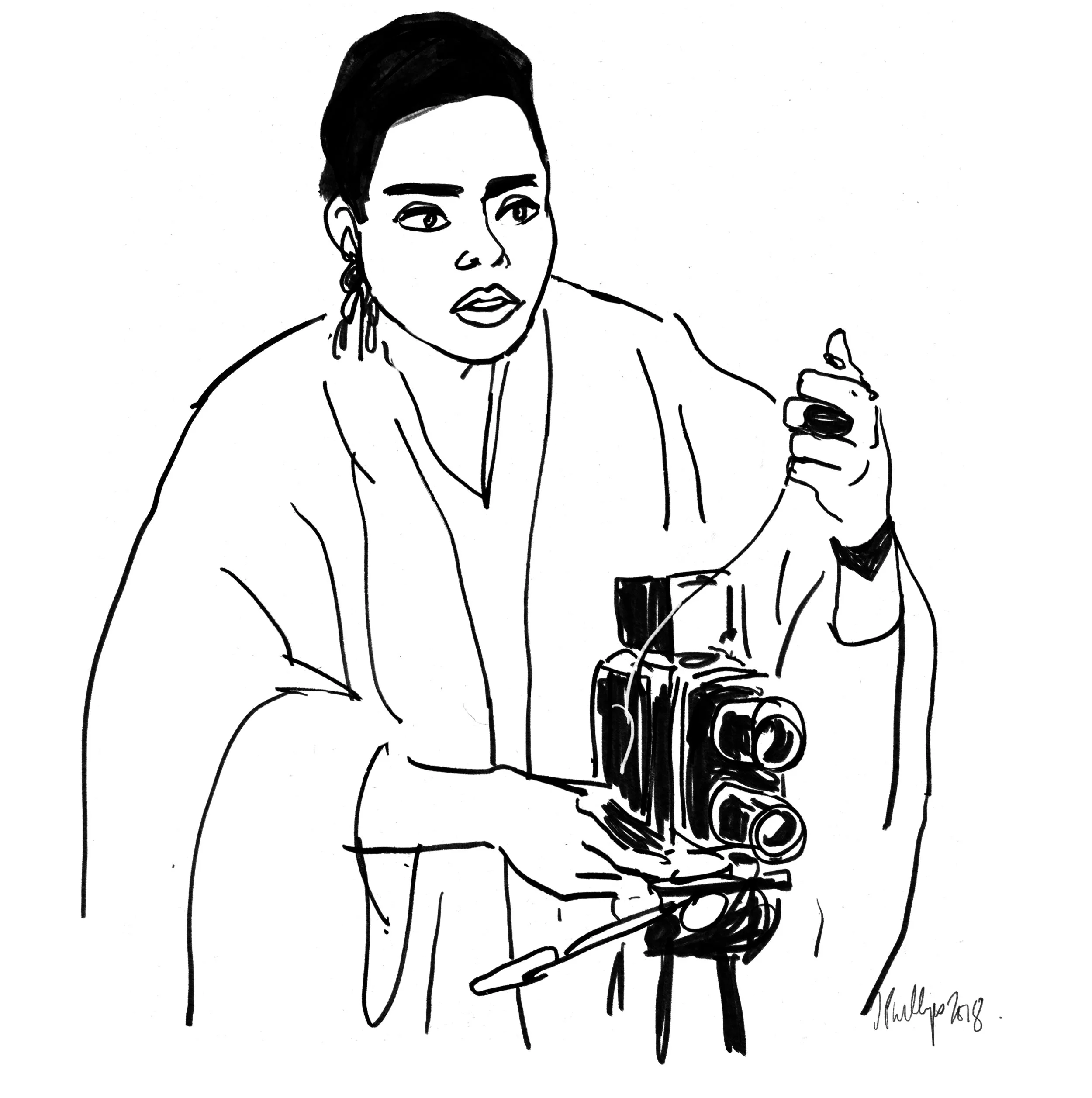
Jack Davison, Photographer
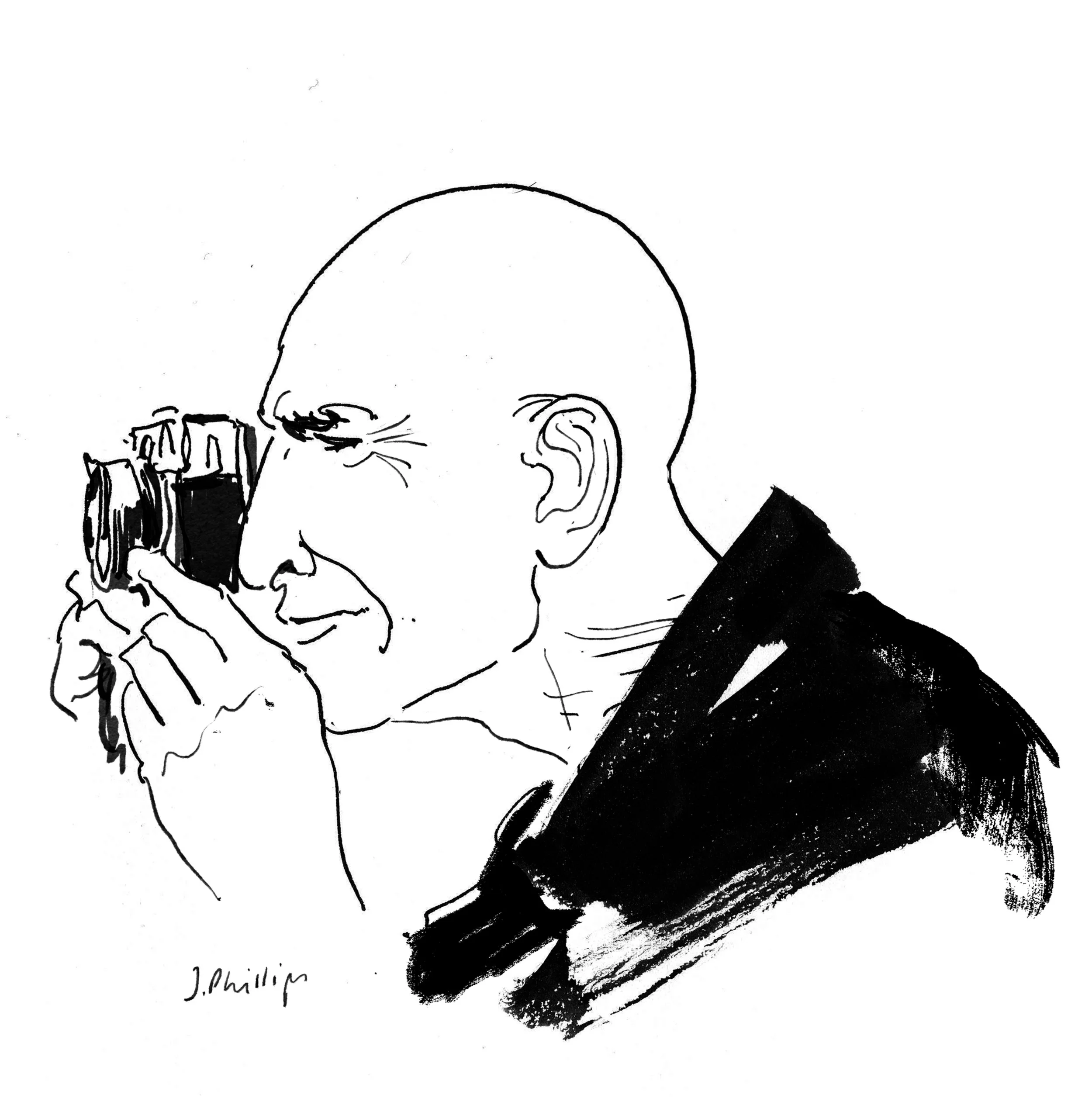
Jack Davison is a self-taught photographer whose work blends cinematic surrealism with gritty shadows, harsh contrast, and mystery. Davison’s work covers a wide spectrum, from a clenched fist, a dog suspended in the air, or raw portraits of Michael Caine and Glenda Jackson. He has shot for the New York Times Magazine, British Vogue, TIME, and many more.
Davison also recently released his first book, Photographs, that spans his career as a photographer since 2007.
He shares four photo books that inspire his work, the process of creating of his first photo book, and how he developed his style throughout his life.
This interview was edited for clarity and length.
Least Wanted: A Century of American Mugshots,
by Mark Michaelson
“I met Mark through my mentor Brett Walker, it was one of the earliest books I remember being handed in Brett's flat. It's an incredible document of human faces, expressions and emotions - and I'd never seen anything like it. It instilled me with Marks own curatorial spirit and I've always been picking up and searching for found photographs. Images that were created with a myriad of purposes (none of them really artistic), but with the passage of time can be seen in a different & beautiful manner years later. Least Wanted has always been the book I return to most frequently and the one I'd be the saddest to lose.”
Picasso At Work: A Photographic Study,
by Edward Quinn
“I adore the cover and the view into Picasso's household and the sense of exuberant creation and spirit within. It's such a beautiful collection of snapshots of his studios, house and details moments of creative development and really champions Picasso's inventive wit. Setting aside the darker sides of his character, the idea that an artist can be so free and humorous when working is really important to me, it's really vital to me that I don't take myself too seriously. That my work can hopefully be made instantaneous and not overly constructed, described or pondered over.”
First Born,
by Arita Taiji
“This is one of newest additions. There's something about Arita's portrayal of his wife and his first child that really compels me. It's the untethered emotion and humor that I love, and the way it spills into the surreal and mundane.”
Looking For Atlantis,
by Colin Thompson
“This is the most deeply thumbed, crumbled, and torn book I own. I've had it since I was a child, and never really parted from it, always resting at a the bottom of a pile of books beside my bed. Thompson's illustrations have such a myriad of elements and tiny scenes playing across the page, that I'd spend hours studying & imagining myself forging a route across the complex drawings. It's a little creepy and odd but always paired with a sense of wonder and silliness which has always been something I would hope would register in my own work.”
Jack, you just created and released your first book, Photographs. What was the process of making the book like?
I've wanted to put pictures in books for ages, I’ve always been thinking about it. I always made little portfolios and books on my own. When the moment finally came that there was publisher interest, I sat with a friend and we edited my work for a dummy. I think it was quite a good start, but nothing came of it perhaps because the publisher was quite traditional in their practice. Eventually my friend suggested we bring it to his pals at Loose Joints.
Loose Joints, founded in 2015 by Lewis Chaplin and Sarah Piegay Espenon, is made up of a really sweet and fantastic couple who seemingly take every book project and do something different every time. They don't have a blueprint, which I quite liked. I've always struggled with making a book, because I'm not really a project-based photographer. Some people might have said "Oh okay, I like these pictures, but I don't really see how they all stick together". Essentially the Photographs book was my way of saying "no, everyone, this is how I see it, this is how I see everything, this is how I see my work as a whole".
How was the interaction with the publisher since they don't work from a blueprint or formula? Did they leave it very open for you? What kind of input might you receive from a publisher that works like Loose Joints?
Basically I gave them my hard drive with everything I've ever done on it, which is a vast collection of images from over the last twelve years, and they went through it all. They also had the selection I made. We worked on it for about half a year, going back and forth. There are pictures in there that they really fought for, which I kind of liked. I wanted someone to come in and have a bit of authorship over it and have it not just be me who has the final say.
Were there any unexpected challenges in creating the book? Any photos that were points of contention where the publishers or you really wanted one and the other person didn't see how it fit?
Oh absolutely. Killing off pictures you love is always a hard thing. There are pictures that I liked that we cut out because they were almost too playful for the book. The book is not unplayful, but there is a picture with my dog and a raw egg shot from below, and I love that picture, but in the context of the book it felt too frivolous and a bit out of place.
We also took out quite a lot of the really straight portraits and focused on the ones that felt less posed and more accidental. There is a portrait of an old man and one of my grandmother that originally were in there, and I originally thought they should be part of the edit, but then it ended up that we got rid of them. I think that was the right decision. But still, you have to go through that process of convincing yourself.
After taking quite a bit of time to get used to it, I now feel pleased with how it feels, the flow of it. I think it's a good mix. So I'm happy with the process. There are still pictures that I think maybe should have been in there, but I think that's the whole point. To get to where you've just decided that it is finished, and that it is out in the world and you can’t do anything about it is a big step. It just takes a little bit of time to get used to!
In this process did you learn anything about your work that you hadn't realized before?
No, not really, I don’t think. It did cement a few ideas in my head. The fact that there's a lot of space in the book and there are a lot of pictures that don't necessarily sit well opposite each other, but they can still flow on nicely from one another. It reaffirmed the importance to me of singular strong images that can stand alone.
A lot of photography that's published is a narrative and it flows from picture to picture very easily and it all makes sense as a whole. But that's not the kind of photographer I am. I've come full circle and realize it’s actually a strength of mine, not a weakness. I used to view it as my downfall, that I didn't shoot in a project format and seeing all the books that were being made at the moment was a little disheartening. In the end though, it just reaffirmed in my head that I don't necessarily have to think the same way.
How would you say your personal style and aesthetic has developed over the years?
I used to really struggle with color work and hopefully I've gotten a better sense of how my pictures work in color now. Earlier on I wasn't really photographing things that were really that colorful. I didn't have that strength in color and my environment didn't make for good color pictures. It sounds simple and a little foolish but it took me a while to realize to make strong color pictures you had to be looking and photographing strong colors.
Then, with shooting editorial and commercial work, clients were always telling me they’d like to see some color options. That was probably the start of my push into color. If people were going to ask for it I needed to do learn how to do it in a way that I was comfortable with. Brett Walker, who I learned a lot from, would tell me, "come on you can't just rely on black and white all the time.”
I started looking at more photographers that worked in color, like Alex Webb. Also the process of printing really changed things for me, because now I do a lot more printing, even with digital images, to help find stronger colors. There is something beautiful about black and white and I still do love it, but I do think it can cover up a lot of things.
So it is in the post-processing where you further developed the color aspect of your pictures?
Yes. Printing it out, re-photographing it or re-shooting it in different light. It’s about making sure that I'm still being experimental in my process, because it's very easy to fall into a rhythm of like “okay this is how I do my pictures”.
So that's a conscious choice to keep yourself on your toes?
Oh absolutely, yes, it’s really important to me.
What's another way which you try to make sure that you stay on your toes?
I try to force myself to use different cameras or just make sure I'm looking more widely for things that inspire me. Looking deeper into other types of work and other art and film. The amount of work and skill that goes into making a motion picture is pretty baffling still to me, and whilst I feel I have a pretty good grasp of framing singular moments, I have only a very burgeoning understanding of that creative process.
You mentioned Brett Walker as a mentor of yours and I was wondering if there are any pieces of advice that he gave you that really changed things.
Well, it's always been to take a lot of pictures and to really make sure you're constantly looking for things. And also the one thing I live by, still, is to crop out everything that's not important, and to make a really tight, strong frame. I see a lot of different pictures and go “hmm that needs a crop”. Brett’s way would be a very brutal school of cropping in that you should take out absolutely everything that isn't significant to that picture.
This point makes me think right away of the photos you took of Glenda Jackson for New York Times Magazine. The frames had so much tension in them, in a good way, and I assume you cropped these.
I did, and I can sometimes find pictures through cropping. Sometimes that is what makes the picture for me. I can come back to an older picture and go, "oh that wasn't quite right", and then I go "oh actually, it just needed a crop".
Actually the picture that got used for the magazine cover annoyingly got published elsewhere without the crop and it just doesn't work as well, which was the only time I've had to be a bit angry. It was fine, it's still like a strong picture but yeah, the way it's so close to her eyebrows is really important.
I recently learned that those images were taken with a little Ricoh II, which is so exciting because photographers can get a little too gear-focused and feel they need to have the most expensive or fanciest old or brand new camera. It’s nice to see work on a cover of a very prestigious magazine being shot with what is essentially a point and shoot.
Yep, it was. Most of my pictures are. That's my main camera to be honest. It’s especially good for actors as well, because they don't expect it. They always think you're not really starting and they're waiting for a big camera to be put in their face and you go "oh no, no we're done actually, we've done all the pictures" and they're like "What? Oh."
I love that little camera, a lot. Just because it's quick and quiet and non-intrusive and you can talk to people and still be shooting. There's no viewfinder so you're not just a big camera head.
What environment do you prefer shooting in? For example, the Glenda Jackson shoot, that seemed like a rather anonymous room.
Oh, that was just in and outside my house actually. I know the space now and I know what works within a 5 minute walk of the house, depending on the day. It's like having home court advantage. It's always, if I can, natural light, usually one directional, from a window or really hard direct sunlight is the ideal. Often you don't get exactly what you want so you have to improvise a bit.
What are the things you do to influence the energy of the environment while you shoot? For example, with Glenda.
It depends, if it's one person usually I won't have assistants, it would just be me, probably my dog running around. It's never really meant to feel like a photo shoot or at least what people expect from one. With Glenda, we just talked and to be honest she is such singularly startling presence that the pictures made themselves. She's without doubt one of my all time favorite portrait commissions.
Have you been in a situation where a subject needed more from you, more instruction, more atmosphere?
Absolutely. I'm not the best director of bodies but I have a few processes I do that make things easier. Sometimes I have someone with me and we'll just throw a water bottle between two people. Just giving people things to do is often a really good thing. In the middle of catching and throwing something, they're completely focused on that and not focused on you, and capturing the moment in between the catch and the throw is often enough.
Something else that my wife taught me—she's also a photographer—is to count out loud and assign numbers to different parts of the room, so if you say one the subject looks at that corner, and if you say two they look at the ceiling.
You've mentioned before that Flickr was a source of inspiration and community for you in the past. Since that's basically gone away, have you been able to replace that with something else?
Instagram in some ways, but I don't have that same community as I did with Flickr, but that's because Flickr was a lot smaller and a lot more photography related. The way in which it presented images was very simple so the images looked good, and you could give them space.
The way you clicked on images and found new photographers just made sense, and it was very quick. You could find a group of people who had similar ideas, and that's where I found Brett [Walker] and my larger Flickr group. We were sharing and reacting to each other's pictures, and it almost felt like it was closed off world of photography. Instagram is for the wider world, where Flickr felt a tiny bit more like a hidden archipelago where you could post work that wasn't related to yourself. I feel like that Instagram becomes very about the self.
Your new book Photographs doesn't contain any text. Can you tell us about the decision making process behind that.
This was something I was set on from the start, trying to include as little text as possible in the book. There are some dates at the start, but that's about it. I wanted people to come to the book and make their own decisions and make their own opinions up about pictures. If they see a picture and I tell them "oh this is this dog that my mom had and actually it's not scary looking but in fact it’s trying to jump for a treat” then that takes away a lot of the mystery of the photograph. Often people see completely different things from what I see and that's the most exciting thing.
Did you have to sell your publisher on the idea of not including text?
No, actually, I didn't. When I sent them all the pictures they were all untitled and undated so they might’ve thought that was a bit of a mess but they were fine with it. It's been a problem with doing interviews sometimes. They might ask for a load of captions and explanations.
There was a newspaper a couple of weeks ago and they really wanted full captions. We fought for a bit about it and I tried to write some and realized it just wasn’t going to work. We ended up using a few text extracts from the book that Lewis had written for the website instead.
You studied English Literature and not photography. In the past you’ve said that when you’ve observed trained photographers they often seemed to impose certain rules onto themselves which would prevent them from taking photos. Can you elaborate on this a bit?
The way I learned was often a process of trying things out and learning as I went. Then I visited a couple universities to look at portfolios and would notice that students spent all year studying to come away with 3 finished pictures, which seemed baffling. They were being taught to think about projects and importance of the idea behind a photography. That is fine and works for some photographers, but at that age you shouldn't be overthinking it. You should just be learning the processes, trying to take as many pictures as possible, learning to imitate different styles and working out what works for you.
There's an interesting mix between personal, editorial, and commercial client work that I see happening with you. Do you take a different approach with each of those?
It really varies from day to day. In an ideal world the editorial work is so close that it is exactly the same process. The Glenda Jackson pictures had the same process as if she was just a lady I had street cast. Obviously with commercial work, when someone is paying you, then they usually don't want you at 100%. They want you at 80%, or at 10%. That took me ages to adjust to because I'd be trying to pour my heart and soul into something, not realizing that's not the point of those pictures or that particular commission. The point is to win a couple of small battles, it might be that you make the casting more interesting or that you use less lighting which makes the pictures feel more naturalistic. That could be the great big difference to that client, instead of trying to re-invent the wheel you can make smaller changes that actually make a big difference.
And then sometimes you're very fortunate and people do want you to do you at 100% for commercial work, but you're still going to struggle against some clothing or styling you don't like, or it could be they choose the casting which takes it away from someone you put in your pictures.
So ideally I'd be doing stuff at 100% all the time, but I now know the job and sometimes realizing it's fine, all of your greatest heroes have done toothpaste commercials, be they musician or artists or photographers, they would all have done those things because you need to do those jobs to live. I think it’s important that you just pick your battles very carefully and as long as you're still creating interesting pictures, that's what people are focused on.
Photo Reference for Illustration: Ally Capelino


